

IndexInstructions
Template guide
Instructions
Pick a tab: Design, Content or Animations. The launch checklist sits below them.
01 Structure
Built on Client First
- Every page runs Navbar, sections, Footer. Each section uses padding global and the 12 column grid global.
- Text uses Client First classes, such as heading style h2 and text color secondary. Most edits are a class swap.
- Home, Studio and Contact come in three layouts. Keep one of each, set the others to draft and update the Navbar and Footer links.
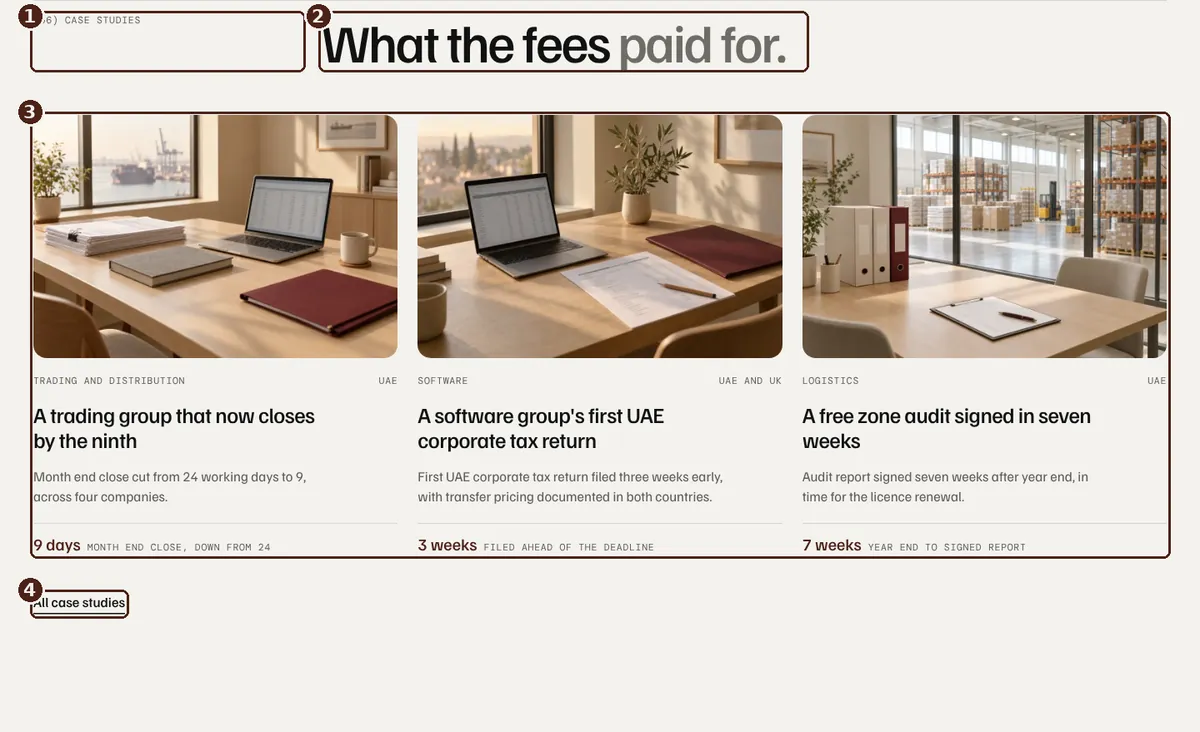
One section on Services
- Label: text style label
- Heading: heading style h2, muted half in a text color tertiary span
- Collection List inside padding global and grid global
- Links: text style link
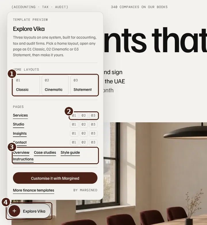
The Template Tour, a preview helper
- Switch the three Home layouts
- Open Studio and Contact in each layout
- Jump to every other page
- The Explore Vika pill. Delete Template Tour from the Footer component before launch.
02 Colour and type
Change the brand in Variables
- Colours, radius and sizes live in the Variables panel.
- Elements use semantic colours such as Text Primary and Accent Primary. Point them at another ramp step to recolour.
- Edit Burgundy 700 (#4C2218) to change the accent everywhere.
- Turn a section dark by applying the Dark mode to its class.
- Spacing and type sizes have Tablet and Mobile modes, so one change covers every breakpoint.
- Familjen Grotesk sets text and DM Mono sets labels, both in Site settings, Fonts.
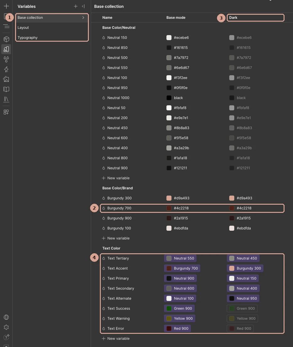
Variables panel in the Designer
- Collections: Base for colour, Layout for spacing, Typography for type
- Burgundy 700: change it to rebrand the accent
- Dark mode: the values dark sections use
- Semantic colours point at ramp steps
03 Components
Edit once, update everywhere
Button
Set Label, Hover label and Link on each instance. Variants: Dark, Small, Light and Brand.
Navbar
Menu, layout switch and template links.
Footer
Links, offices, newsletter form and the Template Tour.
Call To Action
Closing band on Service, Plan, Deadline, Question and Person pages. Set Heading and Muted line.
Partner Close Card
The Talk to Sara card on Home Classic and Pricing. Set label, heading, intro and email.
Client Quotes Slider
The four client quotes on Home Classic and Pricing.
Careers Row
Studio and Team. Set label, sentence and email.
Page Reveal
Load wipe on inner pages. Pick Classic, Cinematic or Statement.
Cards
Insight Card, Insight Row, Case Card, Person Card and Partner Card. Edit one and every list updates. Each sits inside the item link, so props bind to CMS fields.
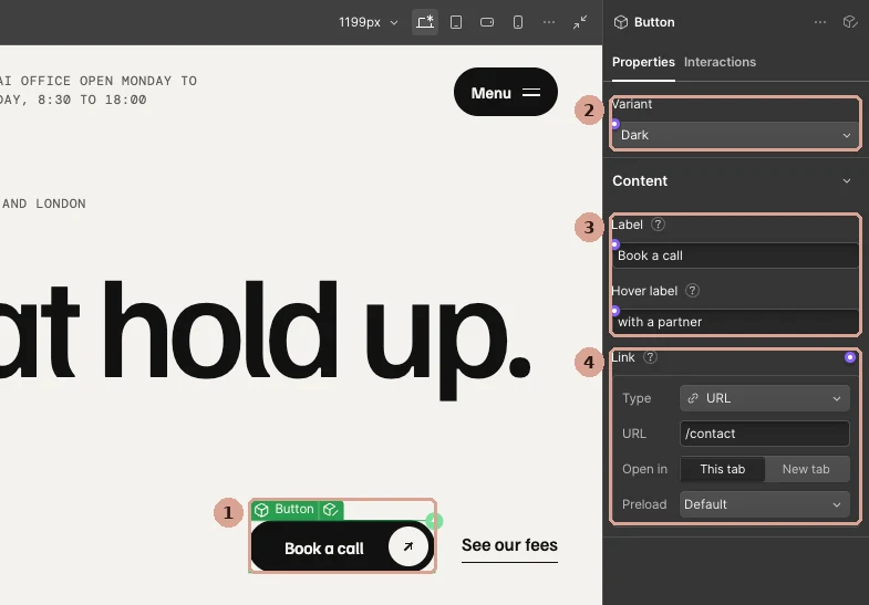
A Button instance selected in the Designer
- Click any button on the canvas
- Variant: Dark, Small, Light or Brand
- Label and Hover label
- Link: page, URL, email or phone
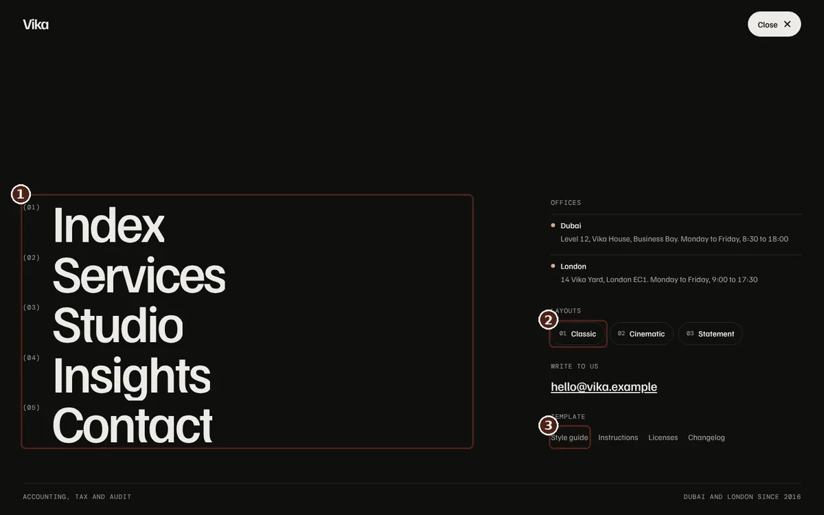
The Navbar menu
- Main links
- Layout switch
- Template links
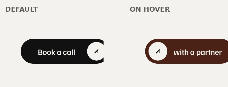
Button hover: the circle slides left and the Hover label finishes the sentence.
04 Images
Swap the sample images
Every photo is a placeholder. Replace them in the Assets panel or on each CMS item.
- Service images: 1600 by 1200 px
- Article covers: 1600 by 1000 px
- Portraits: 1200 by 1500 px (4:5)
- WebP under 150 KB, with alt text on every image that carries meaning
- The Style guide icons are Client First SVG embeds on that page only. Replace or delete them.
01 CMS
Seven collections run the site
Services
Practice pages and service rows. Order sets the sequence.
Insights
Articles. Featured leads the Insights page.
People
Team, Studio and a profile page per person. Taking new clients shows the green badge.
Plans
Fee cards. Type sets Monthly or Projects, Featured adds the badge, Card colour and Text colour restyle a card.
Questions
The FAQ lists. Order sets the sequence.
Deadlines
The tax calendar. Past dates drop off. Add next year's dates each January.
Case Studies
Featured shows a study on Home and Services. Practice links it to its Service page.
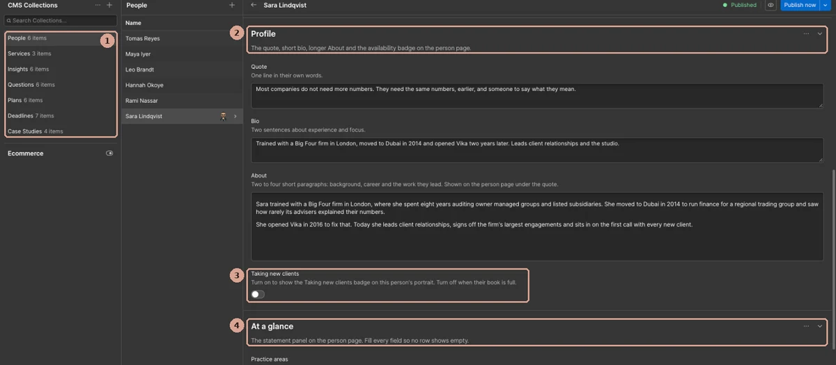
A People item in the CMS
- The seven collections
- Fields are grouped, with a hint under each field
- Taking new clients: on shows the green badge
- At a glance fills the Statement of practice ledger
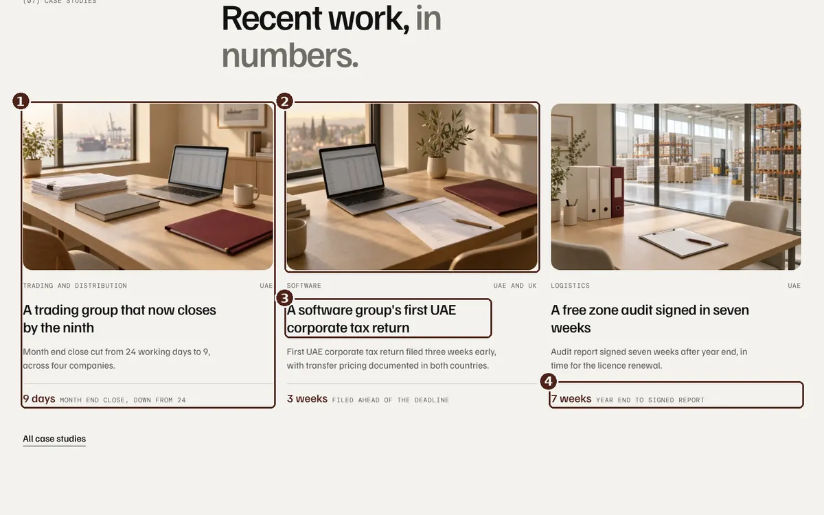
Case studies on Home
- One Case Studies item. Featured and Order control it.
- Hero image
- Name
- Metric 3 value and label
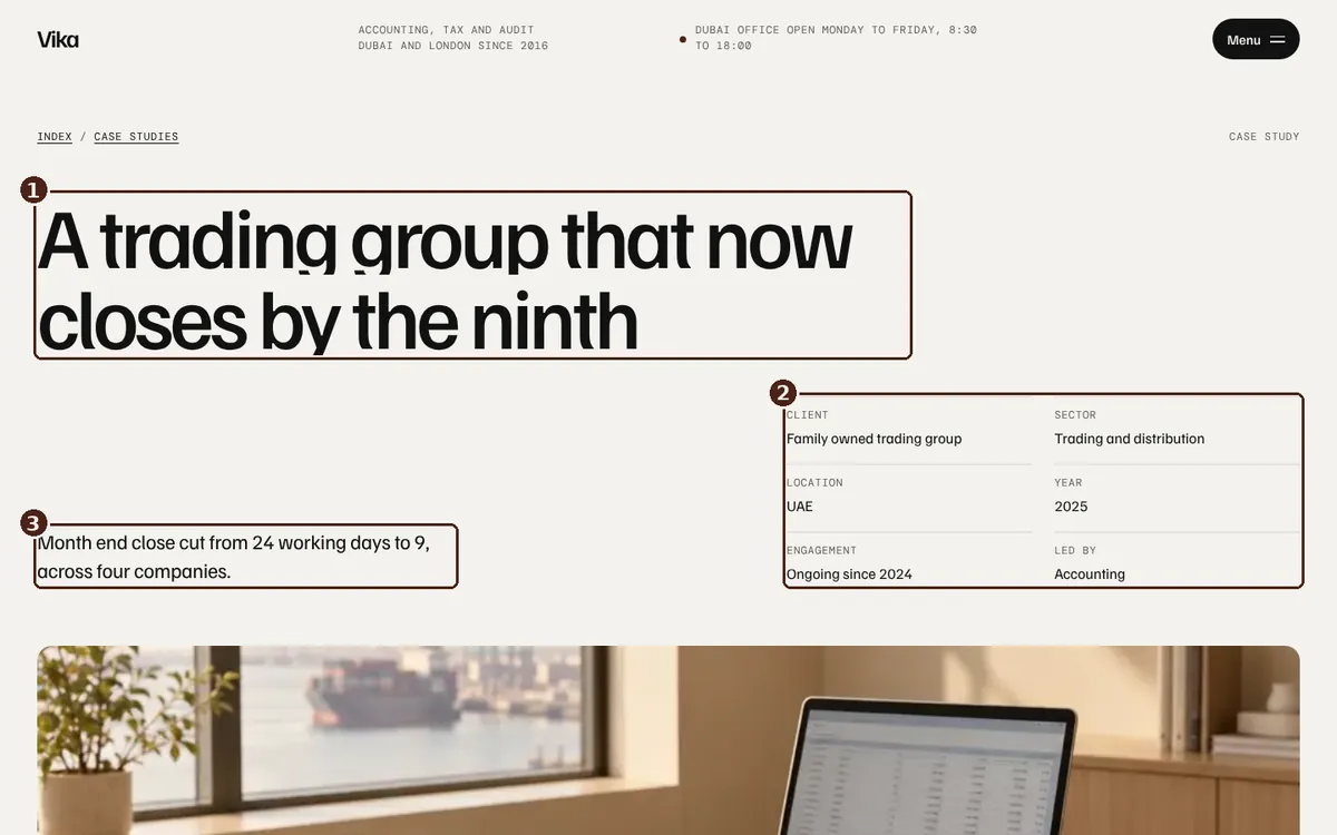
Case study template
- Name
- Overview fields: Client, Sector, Location, Year, Length and Practice
- Headline result
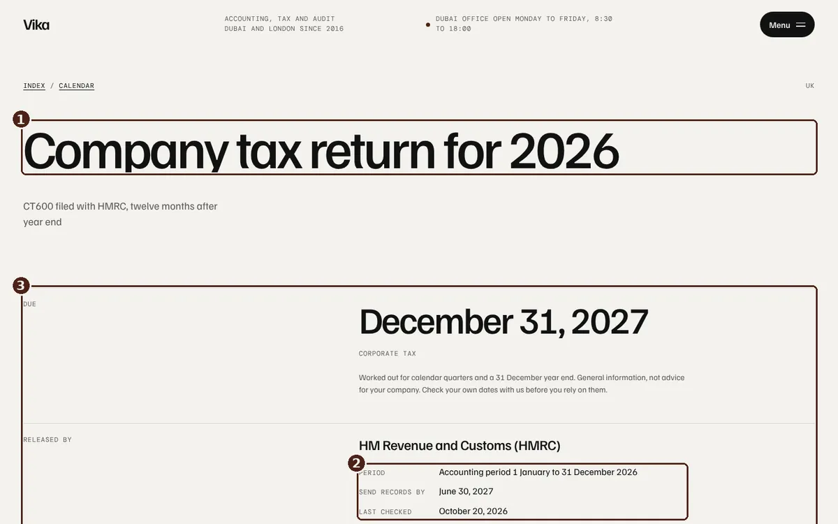
Deadline page
- Name
- Period, Send records by and Last checked
- Due date, type, source and the other Deadlines fields
02 Pricing
Prices for the UAE and the UK
- The region and billing switches need no code.
- Plan cards read Price UAE, Price yearly UAE, Price UK and Price yearly UK from Plans.
- In the compare table and extras, edit both the price_ae and price_uk text.
- Keep is-region-off, is-region-on, is-off and is-on when you run Clean up.
- To drop UK prices, delete the UK button and the price_uk elements.
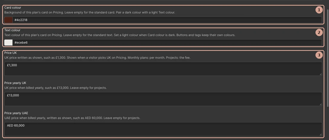
A Plans item in the CMS
- Card colour: the card background
- Text colour: use a light one on a dark card
- UK and yearly prices, typed as shown
03 Forms
Send the form to your inbox
- Set recipients in Site settings, Forms.
- Success and error states are styled. Edit their text from the form's state switcher.
01 Interactions
How to Edit GSAP Animations
Motion runs on Webflow Interactions, which are built on GSAP. Each is named page first, then action, such as Pricing / Show yearly prices. Global means it runs on every page. Three small effects use GSAP in custom code, covered below.
- Open the Interactions panel.
- Pick an interaction by name.
- Select an action to change its duration, delay or ease.
- To skip it on one breakpoint, add a conditional playback rule.
- To remove it, delete the interaction. The element shows in place.
- Keep the reduced motion rule on anything you add.
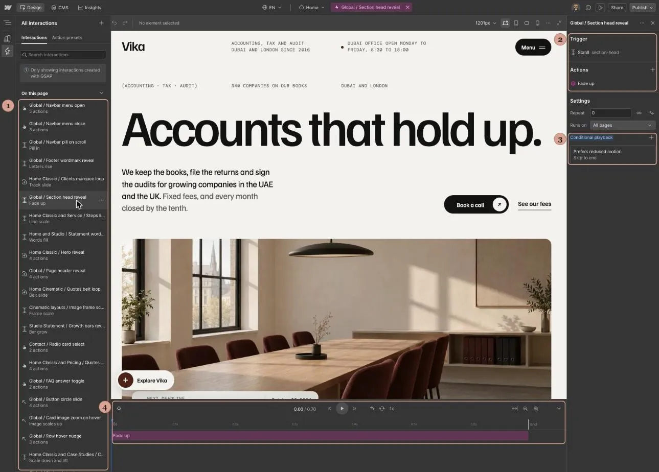
Interactions panel in the Designer
- Every interaction, by name
- Trigger and actions of the selected one
- Reduced motion rule: skip to end
- Timeline: drag or select an action to change timing
02 What moves
Interactions by name
Preloaders
One per home layout. Delete the preloader_component block to switch one off.
Reveals
Page header, Home hero and section heads rise in.
Scroll strips
Home Cinematic cards slide sideways. After adding a service, update the xPercent end in Home Cinematic / Services strip scroll.
Marquees
Client names and the Cinematic quotes belt.
Toggles
FAQ answers and Home Statement practice rows.
Navbar
Menu open, menu close and the floating pill.
Contact
Statement questions step one at a time. Cinematic radio cards highlight.
Hover states
Cards, rows and link underlines use Style panel hover states, not Interactions.
03 Custom code
GSAP in custom code
Three blocks in Site settings, Custom code, Footer code. Each starts with a comment naming its page and action, such as GSAP / Global / Counters count up on scroll.
Office clocks
data-clock-tz sets the city on each clock row.
Menu hover
Dims the other menu links and nudges the active one.
Counters
Add data-count to any figure to count it up.
Key settings
// Vika counters: speed, easing and start point
g.to(o, { v: to, duration: 0.8, ease: 'power3.out',
  scrollTrigger: { trigger: el, start: 'top 85%', once: true } });
// Vika menu hover: speed, dim level and nudge
var d = still ? 0 : 0.4;
g.to(l, { opacity: active && !on ? 0.5 : 1, x: on && !still ? 14 : 0,
duration: d, ease: 'power3.out', overwrite: 'auto' });// Vika office clocks: second hand tick
g.to(k.s, { rotation: deg, duration: 0.35, ease: 'back.out(3)', overwrite: true });Remove a block
- Open Site settings, Custom code, Footer code.
- Delete the block from its comment to its closing script tag.
- Save and publish. Figures and times then show as typed.
Before launch
Seven checks before you go live
- Replace every image and the sample team.
- Rewrite fees, deadlines and articles. Check tax dates against current FTA and HMRC guidance.
- Write an SEO title and description for every page and CMS template.
- Replace the sample Privacy Policy with your own.
- Connect your calendar tool if you take online bookings.
- Draft or delete this page, Overview, Licenses and Changelog, and delete the Template Tour.
Support
Need a hand?
Email info@margined.co for support, or to ask about our setup service.